A1. International Cargo, a shipping company from the United States to Venezuela, sought to go beyond a simple transportation service. Its goal was to create a brand that was not only professional and reliable, but also conveyed closeness, humanity, and a deep social commitment. The challenge was to unify all of the company’s visual elements, from stationery to promotional materials, to reflect this new identity.
The initial constraints centered on the need to maintain the essence of its original logo, which combines the colors blue and orange. These colors were to be the basis for the entire new design, without making the image feel stagnant. Additionally, the brand wanted to incorporate a meaningful message that would differentiate it from the competition and resonate with its audience.

To achieve a cohesive and purposeful brand identity, we developed a comprehensive strategy that impacts all customer touchpoints. The solution focused on three key pillars:
1. The Creation of Paquetín:
An Icon of Connection and Awareness
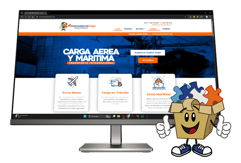
To instill an element of closeness and humanity, we created Paquetín, the brand’s mascot. Paquetín is a humanized box with a special touch: its head is open and filled with puzzle pieces. This design not only symbolizes the idea of an open package, ready to be delivered, but also serves as a powerful way to raise awareness about autism. This detail demonstrates the company’s commitment to inclusion and diversity, transforming the brand into an agent of social change.
2. Unified Design: Consistency in Every Piece
Using the corporate colors of blue and orange as a foundation, we created a unified and vibrant design that is applied to all brand elements. This includes:

3. Visual Impact: Professionalism and Warmth
The result is a strong corporate image that merges the professionalism of the shipping industry with the warmth of a brand with values. Each piece, from the most formal brochure to the most dynamic post, contributes to a coherent and memorable narrative. Paquetín’s presence not only makes the brand more friendly but also educates and raises awareness about autism, transforming the simple act of shipping a package into an experience with a deeper meaning.
This project has allowed A1. International Cargo to consolidate its brand identity, creating a stronger connection with its audience and demonstrating that social responsibility and business success can go hand in hand.
Corporate Image
A1 International Cargo
August 13, 2018
2 to 3 months
We create your visual identity, build your digital home, and give it a voice in the online world. The 360° solution so your brand not only exists, but also impacts.
New Jersey – United States.
All Rights Reserved © 2018 – Pix Gráfico.